
Brand design
Brand design services that make your business recognisable at a glance
Your brand should feel like the same business everywhere it appears. Our brand design services turn strategy into a practical visual identity, with a clear logo system, colour palette, typography, brand assets and rules your team can use across digital, print, packaging and ecommerce.
- Strategy shaped around your audience and position
- A complete visual system, built for everyday use
- Approved brand assets prepared for your team


Why a system matters
Brand identity design services that go beyond a logo
A logo gives people a mark to recognise. A brand identity gives your business a way to look and behave consistently when the website, social feed, packaging and sales materials are created by different people. That consistency is what makes a growing business feel established instead of improvised.
Our brand identity design services define the choices behind the work: logo variants, colour theory, typography, imagery, spacing and layout. Once those decisions are documented in a design system, your team does not have to reinvent the brand every time a new page, campaign or product is created.
Where brands start to lose consistency
A good business can still look unfinished when its visual identity has no shared rules.
Most brand problems are small when viewed alone. The trouble starts when customers meet several of them at once. These are the signs that your brand needs a clearer design system.
-
01
Different logo versions are in use
The website uses one logo, the invoice uses another and a supplier has an older file. A defined logo system removes that uncertainty by making the approved versions and their uses clear.
-
02
Colours shift between screen and print
A colour can look right on a website and wrong on a box if nobody has defined screen and print values. A controlled colour palette keeps the brand recognisable across both.
-
03
Social content looks like a different brand
When every post starts from a blank canvas, the feed slowly loses its visual identity. Repeatable layouts, type rules and image direction give your team freedom without making every post feel unrelated.
-
04
The website and packaging do not feel connected
The storefront creates one expectation, then the parcel arrives looking like it came from somewhere else. Brand design for ecommerce should connect the screen experience to the physical one, from product pages to packaging design.
-
05
Every campaign has to be redesigned from zero
If there are no reusable brand assets or layout rules, every campaign becomes a fresh design problem. A working system gives designers, marketers and partners a clear starting point.
-
06
Nobody knows which font, spacing or style to use
Five people can make five different versions of the same ad when the rules live only in someone’s head. A style guide turns those choices into shared instructions the whole team can follow.
-
The problem is rarely one bad design.
The problem is the absence of a system.
Before / after
Visual identity design that turns scattered choices into one language.
The business does not need more decoration. It needs fewer unanswered questions. Visual identity design makes the important choices once, then gives your team a repeatable way to apply them wherever the brand appears.
Before the first artwork
A visual identity works best when the rules come before the applications.
Before we design the next page, box or social template, we define the system it needs to follow. These six decisions create the visual foundation for everything that comes next.
-
We define the visual idea the brand should be known for. That includes the relationship between the logo, colour palette, typography and image direction. Every later design decision should be able to trace back to this core.
-
We decide which brand assets your team actually needs, rather than creating a large folder nobody uses. The kit may include logo variants, type styles, colours, graphic elements and image treatments. Each piece has a clear job.
-
We set the rules that help people make new work without guessing. Spacing, hierarchy, typography, colour use and layout behaviour are defined in practical terms. This is what lets a design system stay consistent as the brand grows.
-
We test the identity where it is most likely to struggle. A tiny mobile icon, a large sign, a product label and a busy ecommerce page all place different demands on the system. The brand should still feel like itself in each setting.
-
We design for the people who will use the brand after launch. Your in-house team, freelancers, developers and print suppliers need clear assets and instructions. The handover is built so the next person can make the right choice without calling the original designer.
-
We apply the system to real brand touchpoints before calling it finished. If the rules work across web, social, packaging and campaign materials, the identity is doing its job. If something breaks, we adjust the system before final delivery.
Creative direction
The visual identity design starts before the logo.
We begin by agreeing on the visual territory: what the brand should feel like, what it should avoid and how it should differ from competitors. Moodboards and references make those decisions visible early, while changes are still easy to make.
-
 01
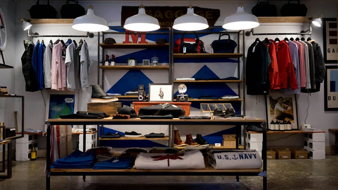
01Tone
Quiet, material, unhurried. The opposite of a discount brand.
-
02
Typography
A heavy display face against a plain text face. Contrast by weight, not by decoration.
-
03
Colour
One ink, one signal, one cue. A fourth colour has to argue its way in.
-
 04
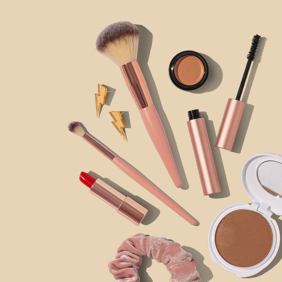
04Image
Daylight, close crops, real texture. No cut-outs on white.
-
05
Composition
Content sits on a visible grid. Edges are aligned, not centred by eye.
-
 06
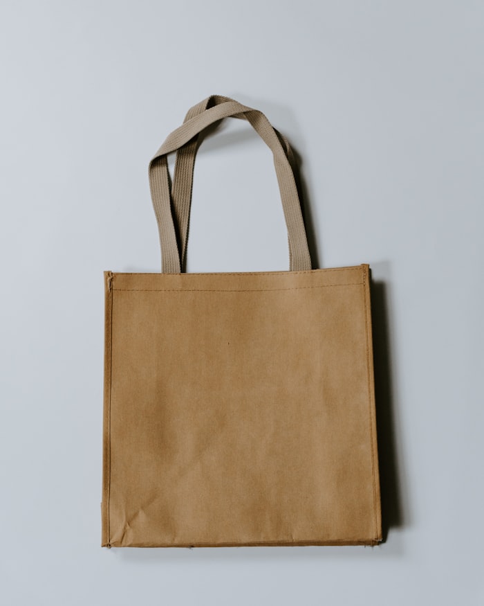
06Application
Every decision is tested on a box and a phone before it is signed off.
-
07
Identity
What is left after the references are removed.
What you receive
A brand system your team can actually use.
Your scope is agreed before the project begins, so you know what is being created and why. Depending on the needs of the business, the final system can include the following areas.
01 Strategy
- We translate the brand strategy into a clear design brief, including audience, positioning and the territory the identity needs to occupy.
- This gives the creative work a reason behind every choice, rather than relying on personal taste.
02 Identity
- This is the core visual identity: primary and secondary logo options, supporting marks, colour palette, typography and graphic elements.
- Together, these brand assets create a recognisable system that can work at different sizes and across different formats.
03 Applied
- We show how the identity behaves in the places customers will actually see it.
- That can include image direction, social templates, ecommerce applications and packaging design, so the brand feels connected from the first click to the delivered product.
04 Documentation
- A style guide records the rules behind the visual identity, including logo use, colour values, typography, spacing, imagery and common mistakes to avoid.
- Final production files are organised for the people who will use them next.
Ownership
Your brand should be easy to use after the project ends.
Once the agreed project is complete and paid for, the approved brand assets are supplied according to the project terms. Your team should be able to keep using the identity without depending on permanent access to an agency account. Where third party licences are required, we make those requirements clear during handover.
Read how ownership worksWho this is for
Brand design for businesses moving into their next stage.
-
01
Launching
A new business needs a visual identity before customers begin forming opinions about it.
This is the cleanest point to define the logo system, typography, colour palette and brand assets because there is no old system to unwind first.
-
02
Growing
The business has matured, but the visual identity still looks like the version created at the beginning.
We bring the design up to the level of the product, service and customer experience without changing what already works for no reason.
-
03
Repositioning
The business is moving towards a new audience, category or price point, and the current identity is speaking to the old one.
We adjust the visual language so the brand supports the new positioning while keeping enough continuity for existing customers to recognise it.
-
04
Rebranding
An established business may need a deeper reset when its identity no longer reflects where the company is going.
A rebrand includes the new visual system and a practical plan for moving existing touchpoints, assets and applications into it.
Branding and marketing services built to work together
Your customers experience one brand, even when the work behind it spans strategy, design, search, content, advertising and customer communication. Our services are built to connect, so each decision supports the next instead of creating another disconnected part of your marketing.
Explore the services below to find the areas your business needs now, while keeping the wider brand consistent as you grow. Whether you start with identity, SEO, content or paid media, every service is designed to work as part of the same system.
- Brand Development Strategy & positioning
- Brand Design You are here
- Logo Design Mark & lockups
- Brand Guidelines Standards & documentation
- Brand Story & Messaging Voice & language
- Rebranding Identity change
- Brand Reputation Reviews & public signals
- SEO Search visibility
- Content Marketing Publishing & distribution
- Meta Ads Paid social
- Facebook Marketing Page & community
- Instagram Marketing Content system
- TikTok Marketing Short-form video
- eBay Marketing Listings & storefront
- Etsy Marketing Discovery & shop
- Google Ads Search advertising
- Google Shopping Ads Product feed advertising
- Email Marketing Lifecycle & flows
Questions
Brand design services: common questions.
These are the questions clients usually ask before scoping a project. The exact answer can change with the size of the brand, the number of applications and what already exists.
-
A project can include strategy, positioning, logo systems, visual identity, colour theory, typography, art direction, packaging design, ecommerce applications and a style guide. We agree the exact deliverables during discovery so the scope matches what the business actually needs.
-
No. A logo can be part of the project, but most businesses also need rules for colour, typography, imagery and layout. Those rules are what make the logo feel like part of a complete brand identity rather than an isolated file.
-
Yes. We start by reviewing the assets already in use, where they appear and what needs to keep working during the change. That audit helps us decide what should stay, what should be refined and what needs to be rebuilt.
-
Yes. If the existing mark still works, we can keep it and build the visual identity around it with logo variants, colour, typography, layout rules and applications. If the logo is causing the problem, we will explain why before recommending a redesign.
-
Yes, when documentation is part of the scope. The guide records logo variants, colour values, type styles, spacing, imagery rules and application examples so other people can use the brand consistently.
-
Yes. We can create packaging direction and artwork for cartons, labels and mailers, with the visual system carried through the structure and layout. Production materials and technical print specifications are then coordinated with the chosen supplier.
-
Yes. Brand design for ecommerce can be scoped alongside store design or development so the identity is built with real storefront behaviour in mind. That helps product pages, navigation, campaigns and packaging feel like parts of the same customer experience.
-
The exact file list depends on the agreed scope. Typically, the handover includes scalable vector files for logos and print, plus screen-ready exports for web, social and ecommerce use, organised so your team can find the right asset quickly.
-
Timing depends on the scope, the number of applications and the speed of approvals. We set the schedule after discovery, once we know what needs to be designed and reviewed.
-
After the project is complete and paid for, the approved assets are supplied according to the agreed terms. Any licences that need to sit in the client’s name, such as certain typeface licences, are handled that way.
-
Yes. We can build post, story and profile templates that follow the same typography, colour and layout rules as the rest of the brand. The goal is to make consistent content easier for a non-designer to produce.
-
Yes. Positioning often sits at the beginning of the brand identity process because it gives the design a clear audience and point of view. Naming can also be scoped separately when research and availability checks are required.
The next step
Give your business a visual language people can recognise
Tell us what the business looks like today, where it needs to go and which parts of the current brand no longer feel right. We will talk through the gap, explain what we would change and shape a brand design scope around the work that will make the biggest difference.
The first call is for understanding the business and the problem. If brand design is not the right next step, we will tell you.