
Logo design
Logo design services built to work everywhere your brand does.
A logo has to do more than look good in a presentation. Our logo design services create a clear, usable mark for the places customers will actually see it: your website, packaging, social profiles, printed material, signage and the smallest browser tab.
- A complete logo system for real-world use
- Tested at small sizes, in one colour and across key formats
- Editable source files and agreed ownership on completion

Professional logo design
A professional logo design should still work when the mockup is gone.
The problems usually appear after approval, when a logo meets a surface it was never designed for. It may look sharp on a large screen but fail on a label, app icon, embroidered shirt or dark background. That is why we design for use first, not for one polished presentation.
We begin with the smallest and least forgiving applications, then build upward. The brand mark is tested as vector graphics, at reduced sizes, in one colour and on different backgrounds. If it survives those conditions, it is far less likely to be redrawn, stretched or improvised later.
The problem
Most logo problems show up after sign-off.
They are rarely complaints about taste. They are practical gaps: a missing file, a version that does not fit, or a mark that loses clarity when the format changes. Good business logo design services solve those questions before they become production problems.
-
01
“Can we get it in white?”
If no reversed version exists, someone eventually improvises one. Fine details disappear, colours shift and the mark starts looking different from place to place.
-
02
The printer asks for vector files
A low-resolution PNG is not enough for large-format print, packaging or signage. We prepare editable vector files so suppliers can scale the logo without losing sharpness.
-
03
The app icon turns into a smudge
Long names, thin lines and extra detail can collapse at small sizes. A logo system needs a reduced version that stays recognisable when the available space is only a few pixels wide.
-
04
The full logo does not fit
A horizontal logo cannot solve every layout. We define alternate lockups, a wordmark and a compact brand mark so the identity can adapt without being squeezed or rebuilt each time.
-
05
The logo moves around in every template
Without clear-space and placement rules, the same logo can look crowded in one design and disconnected in another. Simple usage rules keep the mark visually consistent across teams and channels.
-
06
Nobody knows the minimum size
If a logo is used below the size it was designed for, detail disappears fast. We set minimum sizes for each version so the mark remains readable on labels, social avatars, favicons and printed pieces.
-
These problems are cheap to solve while the logo is still being designed. They are much more expensive after it has been printed, uploaded and shipped.
Draw it once. Build it to last.
Before we draw
Six decisions that shape the mark before the first logo concept.
A useful brief does more than describe what the client likes. It tells us where the logo must work, what it will sit on, how the name behaves and what the market already looks like. Those answers give every logo concept a reason to exist.
-
The mark: six questions we answer first
We start with the smallest place the logo has to work. That might be a favicon, marketplace avatar, label or mobile header. Designing for that limit early tells us how much detail the brand mark can realistically carry.
-
The mark: six questions we answer first
The length and shape of the business name affect the whole composition. A short name may support a bold wordmark, while a longer name may need a different lockup or supporting icon. We decide that structure before polishing the drawing.
-
The mark: six questions we answer first
A logo used only on screens can behave differently from one that will be stitched, embossed, engraved or printed on packaging. We identify those materials before design begins. That keeps fine detail from becoming a production problem later.
-
The mark: six questions we answer first
The mark has to survive on light, dark, photographic and coloured backgrounds. We plan colour and reversed versions rather than leaving those choices to whoever uses the logo next. This makes everyday application faster and more consistent.
-
The mark: six questions we answer first
We review what competitors already look like before choosing a direction. The goal is not to be different for the sake of it, but to avoid disappearing into the same visual habits as the rest of the category. A distinctive logo should still make sense for the business it represents.
-
The mark: six questions we answer first
Some marks are built for a launch; others may stay in use for years. We avoid tying the identity too closely to a short-lived visual trend when the business needs a longer life. The final design should still feel usable when the first campaign is long gone.
Ecommerce logo design
A logo has to work where customers actually meet the brand.
For ecommerce logo design, that means more than a website header. The mark may appear in a marketplace thumbnail, product image, mobile menu, shipping label, packaging, email and social profile. We test the system across those real placements before the files are handed over.
-
01
The mark
One symbol and two words. Everything else in the system is a documented departure from this.
-
02
Type
Drawn letterforms, not a typeface set and left. The name is part of the mark, not sitting next to it.
-
03
One colour
Ink, signal and cue — and the mark has to hold in any one of them alone.
-
04
Clear space
Measured from the mark itself, so it scales with the mark. A fixed pixel value works at one size only.
-
 05
05On material
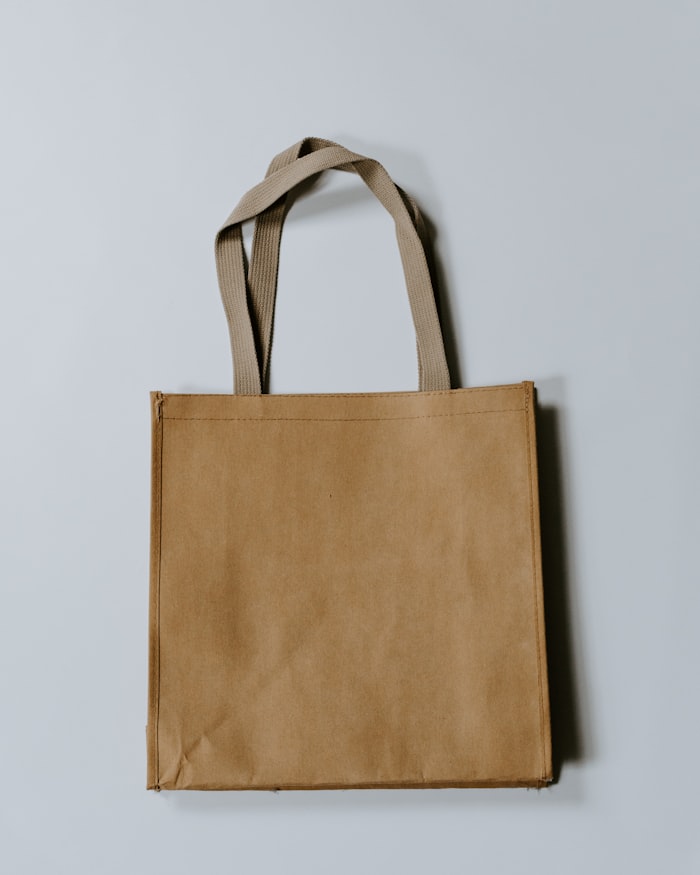
Embossed and stitched. Both remove the fine detail a screen keeps, which is why they set the minimum weight.
-
 06
06On photography
Over a busy image, at a size somebody actually uses. This is where a thin mark disappears.
-
 07
07In the wild
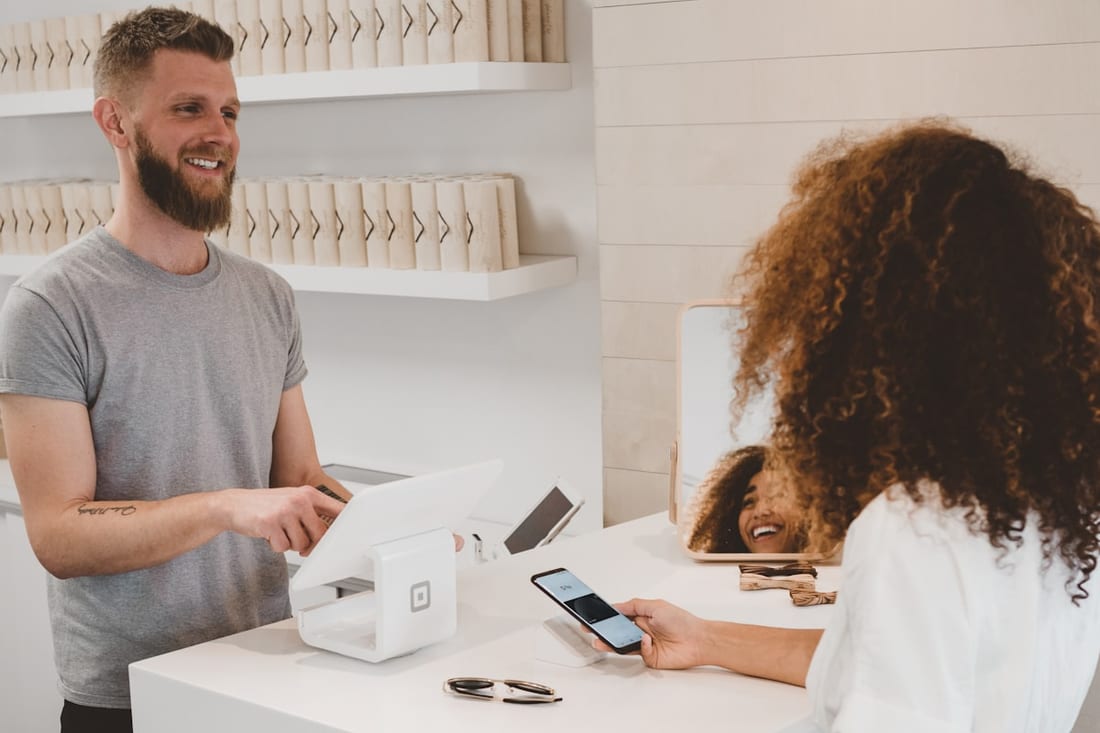
On a receipt, a terminal screen and a card machine — three surfaces nobody designs for and everyone sees.
Logo system
Wordmark vs icon: one logo is rarely enough.
-
01
Primary
This is the main version for layouts with enough horizontal space. It establishes the default relationship between the name and symbol, and every other approved version follows the same visual logic.
-
02
Secondary
The stacked version is built for narrower columns, square placements and layouts where the primary lockup becomes too small. It keeps the same identity while changing the arrangement, not the design.
-
03
Wordmark
The wordmark works when the business name needs to carry the identity on its own, such as document headers, invoices, navigation bars and email signatures. It is also useful when an icon would add clutter rather than recognition.
-
04
Brand mark
The brand mark is the compact visual identifier used when the name already appears nearby. It is especially useful for social profiles, app icons, marketplace avatars and repeated interface elements.
-
05
Monogram
A monogram or reduced mark strips the identity down for difficult production methods such as embossing, stamping or embroidery. It keeps the recognisable idea while removing detail that the material cannot reproduce cleanly.
-
06
Favicon
The favicon is one of the hardest tests because almost every decorative detail disappears. We draw and test a version specifically for tiny digital spaces so the logo does not turn into an unrecognisable blur in the browser tab.
A practical logo system uses the same visual idea in several controlled arrangements. The wordmark, icon, brand mark and lockups should feel related, not like separate logos. Each version has a clear job, so your team knows which one to use when space or context changes.
What you receive
A folder that answers questions instead of creating them.
The handover should make life easier for your printer, developer, marketer and future designer. Every file has a purpose, every version is labelled, and the usage rules are simple enough to follow without coming back to us for routine questions.
01 Source
- You receive an editable vector master with the approved logo system organised clearly for future use.
- The source includes the main lockups and supporting brand mark, with layered and outlined versions where appropriate.
- Files can be prepared in Adobe Illustrator-compatible formats so a professional designer or supplier can work from the original artwork.
02 Exports
- We supply practical exports for the channels your brand uses, including SVG and PNG files at suitable sizes.
- Reversed, one-colour, favicon and app-icon versions are prepared as part of the system instead of being left for someone to recreate later.
- This gives your team ready-to-use assets for web, ecommerce, social and everyday marketing.
03 Rules
- The folder includes simple guidance for clear space, minimum size and approved logo use.
- We also show the common mistakes to avoid, such as stretching, recolouring or placing the mark on a background that reduces legibility.
- These rules keep logo revisions and production decisions consistent after handover.
04 Print
- Print-ready references cover the colour information and simplified versions suppliers are likely to need.
- Where the project requires it, we include artwork suited to embroidery, embossing or similar production methods, plus a concise supplier reference.
- The result is a handover that works beyond the screen.
Ownership
The approved mark and source files are yours.
Once the agreed project is complete and paid for, the approved logo files are supplied under the ownership terms set out in the project scope. You receive the editable source artwork as well as the everyday exports. Trademark registration itself is a legal service, but we can prepare trademark-ready files that your attorney can use during the application process.
Read how ownership worksBusiness logo design services
Four moments when a business needs more than a quick logo file.
-
01
Launching
A new business needs a mark before the website, packaging and marketing can settle into place.
Starting from a blank page gives us room to build the right logo system from the beginning, including small-size versions and the files future suppliers will need.
-
02
You have outgrown the old logo
The current mark may have been made quickly when the business was smaller. It can still be recognisable while feeling hard to use, dated or technically weak.
We can rebuild the drawing, clean up the vector construction and extend it into the formats the business now needs without changing more than necessary.
-
03
New sales channels
Moving into ecommerce, marketplaces, packaging or paid social exposes weaknesses that a single website logo can hide.
We adapt the system for square crops, mobile layouts, product packaging and other placements so the identity stays recognisable as the business expands.
-
04
The logo was never documented
Sometimes the mark itself is fine, but nobody has agreed how to use it.
We can formalise the lockups, colours, clear space, minimum sizes and export formats so the same logo stops appearing differently across the business.
Branding and marketing services built to work together
Your customers experience one brand, even when the work behind it spans strategy, design, search, content, advertising and customer communication. Our services are built to connect, so each decision supports the next instead of creating another disconnected part of your marketing.
Explore the services below to find the areas your business needs now, while keeping the wider brand consistent as you grow. Whether you start with identity, SEO, content or paid media, every service is designed to work as part of the same system.
- Brand Development Strategy & positioning
- Brand Design Identity & visual system
- Logo Design You are here
- Brand Guidelines Standards & documentation
- Brand Story & Messaging Voice & language
- Rebranding Identity change
- Brand Reputation Reviews & public signals
- SEO Search visibility
- Content Marketing Publishing & distribution
- Meta Ads Paid social
- Facebook Marketing Page & community
- Instagram Marketing Content system
- TikTok Marketing Short-form video
- eBay Marketing Listings & storefront
- Etsy Marketing Discovery & shop
- Google Ads Search advertising
- Google Shopping Ads Product feed advertising
- Email Marketing Lifecycle & flows
Questions
Logo design questions, answered.
These are the practical questions that usually come up before a project starts.
-
We present a focused number of logo concepts rather than a large gallery of unrelated options. Each direction is tied back to the brief, the category and the places the mark needs to work. Once a direction is selected, we develop it through the agreed logo revisions.
-
Yes, ownership of the approved work is handled according to the project terms agreed before design begins. The final handover includes the editable source files and agreed export formats.
-
Trademark registration is a legal process, so we do not act as your attorney or file the registration for you. If registration is planned, tell us early. We can prepare clean, trademark-ready files and keep the visual system organised for the legal team reviewing the mark.
-
Yes. If the idea is still right but the artwork is weak, we can redraw it as proper vector graphics, improve small-size performance and build the missing versions around it. A full redesign is only necessary when the mark itself no longer fits the business.
-
The exact list depends on scope, but a typical handover includes editable vector files plus SVG, PDF, PNG and other useful exports. We also prepare channel-specific versions such as favicons, social avatars and one-colour marks when they are part of the agreed system.
-
Logo revisions are agreed during scoping and written into the project. More rounds do not automatically produce a better result; a strong brief and clear approval process usually matter more. We define both before the design work starts.
The next step
Show us where your logo has to work
Tell us where the logo will appear, how small it needs to go and what the business needs it to do next. We will use those answers to recommend the right scope, whether that is a new professional logo design, a repaired existing mark or a complete logo system for ecommerce and print.
A discovery call is a working conversation. If the existing logo can be fixed instead of replaced, we will tell you.